
brand story
ebridge
travel technology
power up.
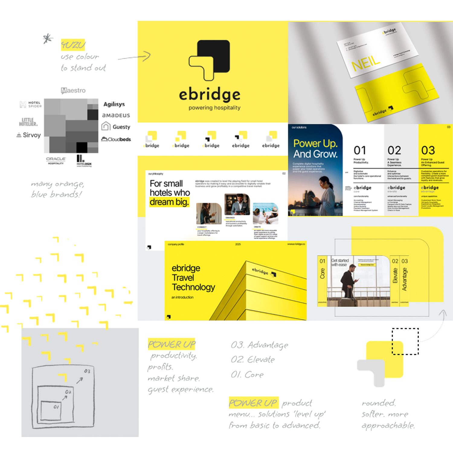
“Make a technical product more relatable.”
category
Travel and Hospitality Technology Solutions
goal
Simplify and make it easy for customers to understand a complex digital hospitality solutions offer.
highlights
A story highlighting the founder’s philosophy - empowering small hotels to grow through digital transformation. A product menu matching solutions with customer priorities, enabling cross-selling and up-selling. All communicated through a clean, fresh design that gives the brand’s image a much-needed modern update.
scope
brand strategy
brand architecture
brand naming
brand identity
communications design